The Actions view provides a display of all of the available actions that are in context for the given selection in the editor.
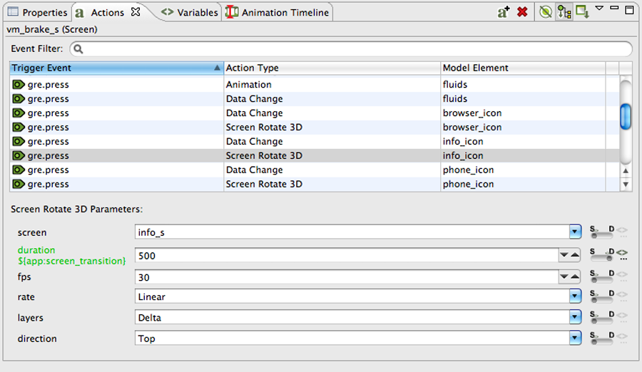
Actions can be added through the right click menu in the editor, Add > Action… or in the Actions view directly.
The content of the action list can be sorted by selecting the action table
title. When actions are sorted by their triggering event the order in which
they appear will also correspond to the order in which they will be
evaluated within the same context. If two actions are bound to a
gre.press event on the same control, for example a Data
Change and then a Screen Fade, then the first action in the list will be
executed (Data Change) before the next action (Screen Fade). The order of
these events can be adjusted by right clicking on the event and selecting
Move Up or Move
Down as appropriate.
The content of the action list is automatically populated based on the Designer model object selected in either the editor or in the Application Model view. The content of the list can be populated in several ways:
- Selection Only
This will show only the actions associated directly with the selected model object.
- Sub Hierarchy
This will show the actions of the selected model object and all of its child model objects.
- Application Hierarchy
This will show all of the actions in the project
In addition to controlling how the list is populated using the toolbar selections, it is also possible to use the name filter at the top of the list to match against specific event names. This is particularly useful when used in conjunction with the Application Hierarchy to search the entire project for custom events.
The triggering event, action type and context can all be edited inline in the action table. Each action also has its own set of parameters or configuration options. These values can be changed in the lower display area of the Action view once an action selection is made. When the action types are changed, as many argument values from the original action will be migrated to the new action as long as the argument names and types match.
The Application Model view displays a tree representation of the model objects that make up the Storyboard application.
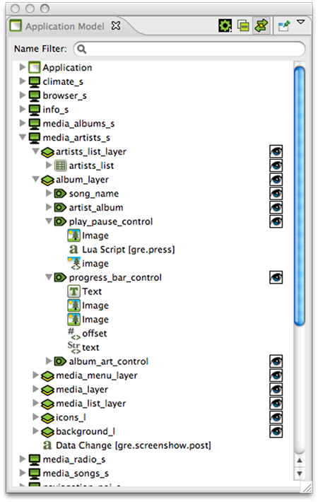
The tree representation aligns with the Storyboard model representation and allows editing operations to be performed on elements that may not necessarily be visible within the editor.
Application
Screen(s)
+ Layer Instance(s)
+ Control(s)
+ Render Extensions
+ Animations
+ Scripts
+ Unused Layers
For each of the application, screen, layer and control objects the Application Model display the Actions and Data Variables associated with that model object
The visibility of the layer instances and controls can be quickly adjusted through the Application Model view by toggling the setting in the visibility column. The changes made here will be immediately reflected in the editor and will also be reflected in the Storyboard Engine runtime file as the initial setting for the layer instance or control.
Since layers are displayed as layer instances, the tree will show layer and control content several times in the tree. If the Link with Editor toolbar option is enabled, when a model object is selected in the Application Model view the editor will automatically scroll to present the appropriate context of their selection. The same behaviour can be achieved by double clicking on a model object if the view's content is not synchronized with the editor.
The Application Model view tree also displays all of the scripts, animations and unused layers that are currently a part of the application design.
The Animation Timeline view provides an editing environment for creating the animation blocks that are used by the animation action.
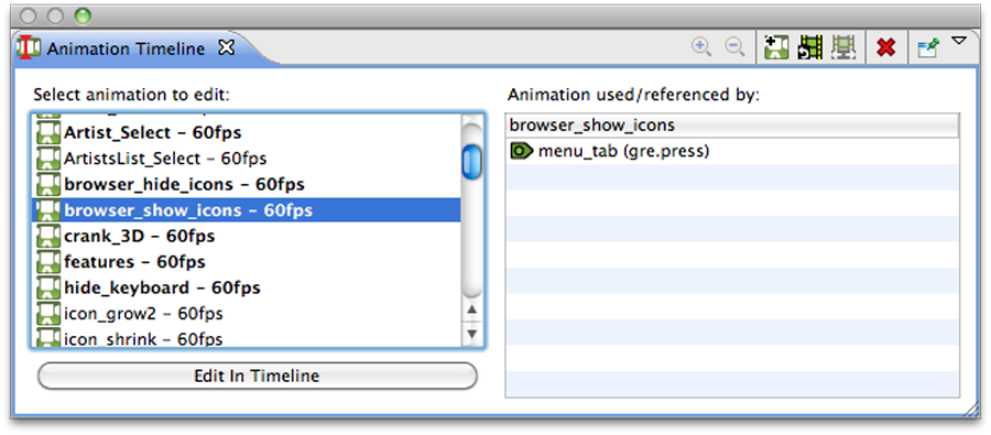
The initial Animation Timeline presentation displays a list of all of the animation blocks defined the application. Those animations whose names are highlighted in bold represent animations that are currently referenced. The list on the right is updated, based on the selected animation, to show a list of all of the locations in the project where this animation is currently referenced.
Double click on an animation or selecting the Edit in Timeline button will change the display mode of the Animation Timeline from a list of all animations to an timeline based editor focused on the selected animation block. To create a new animation simply right click in the list and select Add Animation or select the Add Animation from the toolbar.
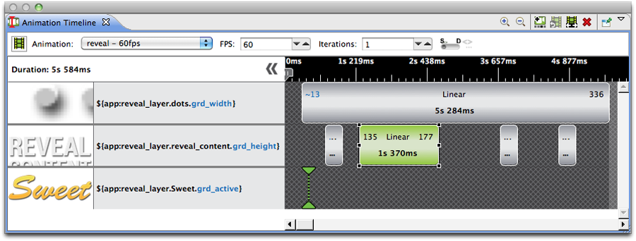
The timeline editing mode displays a list of the variables that are being modified during the animation and a timeline view indicating the starting time offset and step duration for a particular animation step relative to all of the other animation steps running in this block.
You can drag and drop the block within the display to adjust the starting offset or lengthen or shorten its duration by resizing the block. The start, end values and the rate of change can be adjusted inline by double clicking on the values or by right clicking on the block.
If you want to make a more significant change to the animation step, or change several values all at once, then you can double click on the step and it will open the Animation Step Dialog. You will also get this dialog if you right click and select Add Animation Step to add a new variable to be animated in this block.
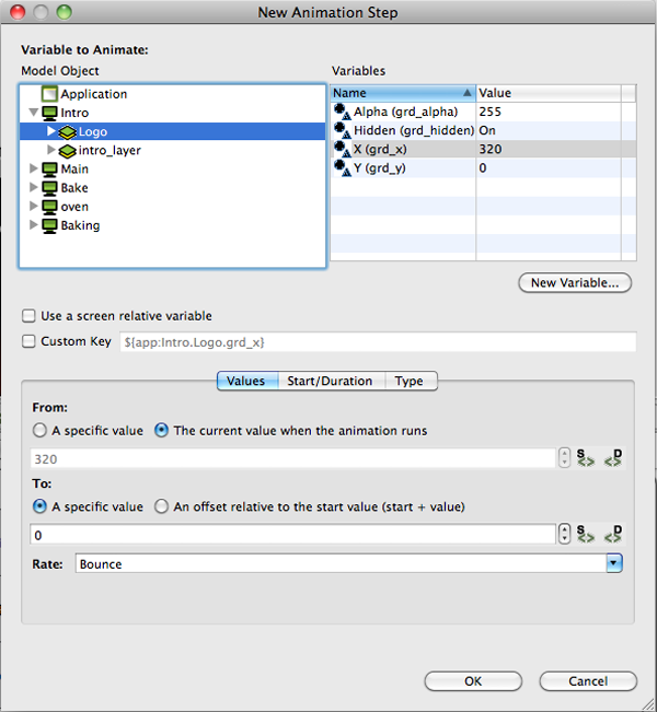
The Animation Step Dialog allows you to select the variable that you want to animate and then fine tune all of the characteristics of the animation step including how you want the values to change and when.
There are a number of ways to get started creating animations. It is always possible to manually create a new animation from the Animation Timeline View and add the variables to the animation one by one however, Storyboard provides a few shortcuts to make this process easier.
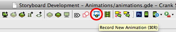
To create new animations Storyboard provides a mechanism that allows you to record a series of changes to your application and have those changes automatically incorporated into a new animation. This is called Animation Recording mode and is accessed while in the Storyboard Editor from the top menu bar.
The animation recorder will track all changes that are made to model objects in the application and when the recording is finished it will automatically create new variables for those static values that have changed and then gather all of the changed variables and place them into a new animation ready to replay that visual change.
Note
When using the animation recorder, any structural changes made to the model will be automatically reverted and lost at the end of the recording. The model recording only tracks changes to existing model attributes and variables, creating variables automatically for any static elements that change.
This means that if during the recording any controls, variables, actions or any other model elements are created, they will not be captured in the recording and they will also not be present in the model when the recording is stopped.
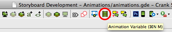
To quickly add new variables to either a new animation or to an existing animation, then you can use the Animation Variable command that is available from the editor toolbar or as a right click menu on many model objects.
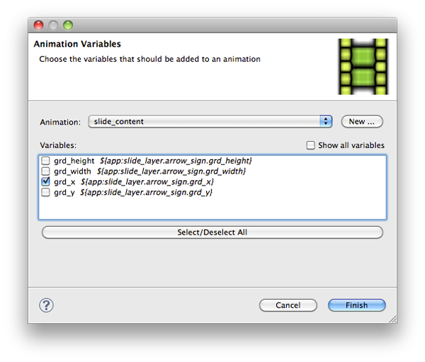
When this option is used a dialog will be opened that will display all of the variables that are associated with the current selected object. You can quickly select those variables you are interested in, select the animation that you would like them to be applied to, and immediately start fine tuning that animation.
The Font Styles view is not automatically included in the default Storyboard perspective, but can be included by selecting it from the selecting Window > Show View from the main menu.

The Font Styles view displays the currently defined font styles for the application. A font style is a combination of font colour, size and other attribute information and can be used to more quickly configure text styles used within the application.
While Designer provides an editing environment that groups the font name, size and colour together, the Storyboard Engine runtime environment considers each of these to be separate properties that can individually be assigned values. To provide a common theme throughout the application interface, it is suggested that common font values be assigned to application global variables that can be easily adjusted to adapt to different language or presentation requirements.
The Images view provides a thumbnail presentation of those images that are currently included in the application design.
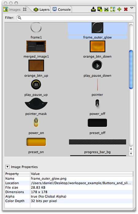
The content for the Images view is automatically pulled from the image file content contained in the images directory of the Storyboard project, new content that is imported into this directory in the filesystem will, upon a workspace refresh, be automatically shown in the Images view. Supported image file formats include PNG, JPG, GIF and BMP files. In order to import Photoshop PSD file content, the images must be imported using the File > Import > Photoshop PSD File wizard.
Images can be drag and dropped from the Images view directly into an application design. By default a new control will be created that matches the images size and whose image source is a static value pointing at the dragged out image.
Within the Images view it is also possible to quickly switch an image that used in one context to another using the Swap Image With... right click menu. For example if a number of controls were using an image as a button background and a new image was available that provided an updated look, then after importing the new image one could select the existing image and choose Swap Image With... to quickly change all instances within the application to the new look.
All files contained within the images folder will attempt
to be processed as images, regardless of their file extension. If an unrecognized
image file is encountered then by default it will not be displayed. This behaviour
can be adjusted by de-selecting the Show Only Images in the view's
drop down menu. This menu also provides the ability to group images by directory
which is a convenient way to classify images that are used in different parts of
your user interface.
As an application evolves, it will often accumulate a number of unreferenced or duplicate resources. The Image view offers a few utilties to help manage these images.
The Resource Clean Up toolbar action allows the pruning and deletion of unreferenced images from the application design.
The Consolidate Images toolbar action allows duplicate images to be identified and to have their references all consolidated into a single resource and for the duplicate images to be removed from the workspace.
The Trim Images toolbar action works on selected images to remove all of the extraneous transparency that surrounds non-transparent content. This can significantly impact the performance of rendering on systems without hardware graphic rendering capabilities.
The Split Images toolbar action works similarly to the Trim Images option but transforms a single image with significant areas that are competely transparent into multiple images with that transparency trimmed away.
The Layers view provides a thumbnailed display of the layers used by the currently selected screen and also displays a thumbnail of all of the other layers that are available for use but are not bound to the currently selected screen.
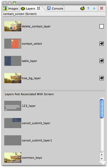
Layers are categorized as either being included on the current screen or not. Layers can be added or removed from the current screen by dragging and dropping them either into or out of the current screen area, or by using the delete key.
Layers are listed according to their front (top) to back (bottom) order z-order presentation. This order can be manipulated by dragging and dropping the layers within the view or using the toolbar buttons. In addition the Layer view provides the ability to change the visibility within the application. If the visibility or z-order are changed, the change is immediately reflected in the editor and will also be reflected in the Storyboard Engine runtime deployment.
Using the toolbar controls in the Layers view it is possible to create new layers and also to open up the Layer editor mode to work with layers independent of the screens with which they are associated.
The Navigator view is a standard filesystem style explorer limited to showing only content available in the Storyboard workspace.
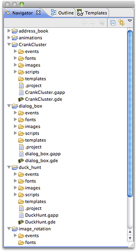
The Navigator view only displays content that has been imported into the workspace and starts with the top level Storyboard Project directories that have been created. Since the workspace allows multiple Storyboard projects to be shown, it is possible to work on multiple projects concurrently all within the same workspace with multiple editors open targeting different Storyboard project. Content and resources can be copied and pasted among different the different editors.
The Navigator view provides a variety of filters to hide/show different file types as well as the ability to group projects together as 'working sets' and then to only display the content from those working sets. For more details on configuring the Navigator and filtering workspace content refer to the Eclipse help Help > Help Contents > Workbench User Guide.
The Outline view provides an overview of the entire editor. The outline content will change to reflect an outline of the editor that currently has focus. Within the Designer environment there are two Outline's of interest, the Storyboard editor outline and the Lua editor outline.
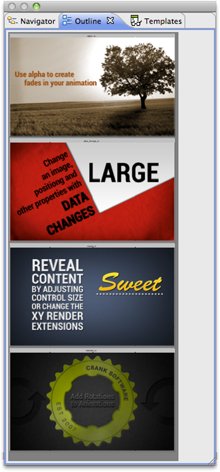
The Storyboard editor outline displays a scaled visual presentation of the entire contents of the editor. If the editor is in Application mode then all of the screens of the application will be shown, if it is in Layer mode then all of the layers will be shown and similarly for the other editor modes. By moving the highlighted area within the Outline view it is possible to change the viewport of the current editor.
The Lua script editor outline displays a listing of all of the identified functions in the file and supports the quick navigation to those functions by double clicking on the function name.
The Problems view shows a list of all problem markers that are created within the workspace. Storyboard provides a project analysis mode that runs in the background to examine Storyboard models and report on design concerns. To enable or disable this analysis mode you can change the Storyboard workspace preference setting in Windows > Preferences > Storyboard > Enable Background Storyboard Project Analyzers.
When the Storyboard Project Analyzers are enabled then as workspace resources change the model will be scanned and analyzed and discovered issues will be reported into the Problems View. Issues that are scanned and reported include:
Mis-matched image colour depths. If a 32bit colour image is used with a 16bit colour display then there is a possibility the image will be distorted on the target
Fill hides content. When a fill masks on top of other content then this can be an ineffective use of processing resources on target devices.
Missing render extension content. For example a control with an image render extension that is not defined or does not exist. This may result in additional computations being performed by the embedded target.
Scaled or rotated static image content. Since static images do not change at runtime the work required to scale or rotate an image could be replaced by a fixed cost of rotating or scaling the image during the design. This will reduce the amount of processing required at runtime.
The Properties view displays information about the current selection in the editor and also provides the ability to change and adjust the properties of that selection. The Properties view is the primary editing location for fine tuning the visual presentation and adjusting data bindings of the application.
For each model element, application, screens, layers and controls, there is a different property interface that provides access to those items that are most relevant to the selected context. The following is a non-exhaustive list of some of the property pages.
- Application
The application properties, active when the editor background is selected, show the application name, size and colour attributes.
- Screen
The screen properties, active when a screen is selected, displays the screen name and information about the layers that have been associated with that screen.
- Layer
Layers and Layer Instances share a common set of property pages. A Layer Instance is simply a Layer that has been associated with a particular Screen. Changes made to a layer's size or it's controls will be propagated to all layer instances. Position and opacity however are properties that are not associated with the layer but are associated with a layer instance.
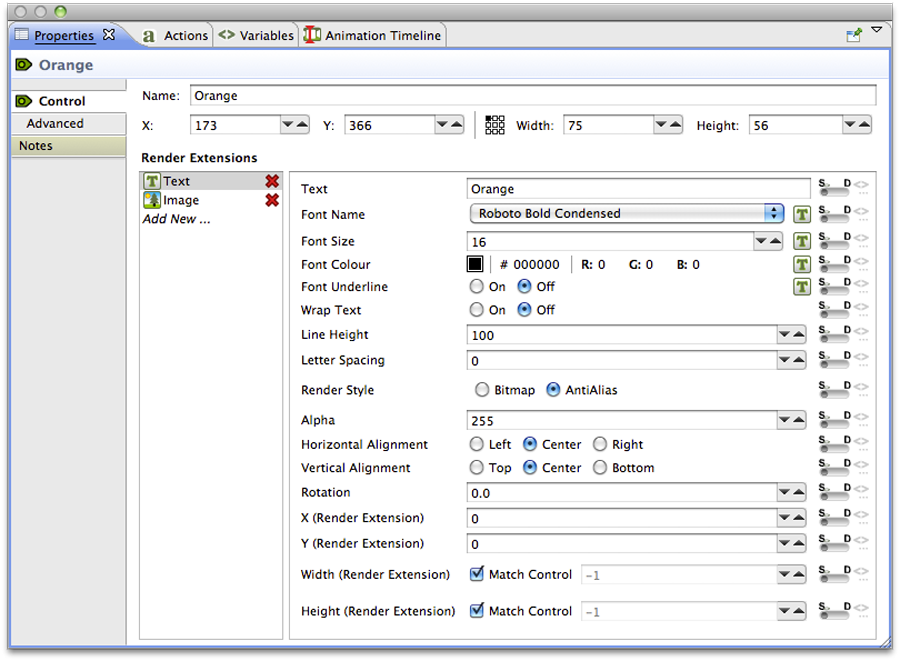
- Control
Controls contain the most sophisticated property pages because in addition to the name, size and position information the property page also contains all of the configuration parameters for the render extensions associated with that control. The render extensions are listed in the Z order (front to back) that they will be rendered within the control and this can be adjusted by dragging and dropping the render extensions within the list entry.
- Render Extensions
Render extension property pages show the argument details of the selected render extension. This is the same information as is shown within the Control's property panel, but without all of the additional details associated with the control.
- Actions
Action property pages show the argument details of the selected action. This is the same information as is shown within the Action's view but it is presented without all of the context and triggering event detail that is presented in the Action view.
On some selections, notably the application, screen, layer and control model elements, the properties view will also contains a Notes tab that allows arbitrary text information to be added to the design model. This information is maintained in the model and is exported within the application .
The Templates view provides users with a list of templates that are available for use in this project. The list of available templates is generated automatically from the contents of the project's templates directory.
When a template is selected its description along with a graphical preview of the template will be shown if they are available. To create a new model object (control, layer, screen etc) that is based template, select one of the template items and drag and drop it into your application.
Not all templates create new Storyboard model objects. Some templates simply enhance the functionality of an existing object and when this is the case, when a model object is selected you can right click on the object and select Templates Apply to access a list of available templates.
For more information about creating templates, see the document section entitled Working With Templates.
The Variables view is similar to the Actions view in that it displays all of the data variables that are in the context of the current selection.
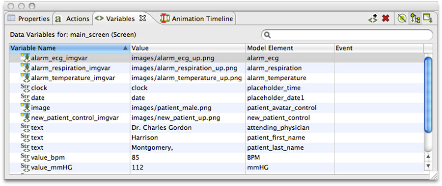
Once a variable is defined and associated with a particular model object context (application, screen, layer or control) then the variable can be referenced as a parameter for actions and render extensions.
There are two different types of data variables that can be defined. A normal variable contains a name, a type (ie number, string) and the value matching the type that should be used when the variable is referenced. To facilitate working with repetitive data within a table control, a special type of variable called a table cell variable can be created. This variable contains all of the same attributes as a normal variable, but is extended to contain an additional row and column information that can be used to specialize a particular value at a given table row and column.
The content of the variable list can be sorted by selecting the appropriate variable table title and the variable values can be edited inline in the variable list by double clicking on the appropriate field that you wish to change.
The content of the variable list, similar to the action list, is automatically populated based on the Designer model object selected in either the editor or in the Application Model view. The content of the list can be populated in several ways:
- Selection Only
This will show only the variables associated directly with the selected model object.
- Sub Hierarchy
This will show the variables of the selected model object and all of it's child model objects.
- Application Hierarchy
This shows all of the variables in the application, regardless of what the current selection may be.
In addition to controlling how the list is populated using the toolbar selections, it is also possible to use the name filter at the top of the list to match against specific variable names. This is particularly useful when used in conjunction with the Application Hierarchy to search the entire project for a variable.
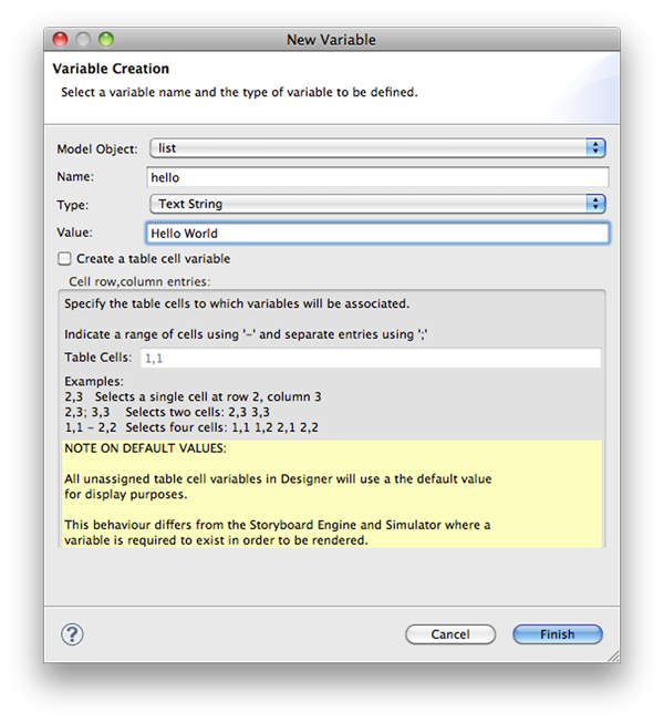
New variables can be created from within the Variables view or at other points within Storyboard Designer. In all cases the variable creation will open New Variable wizard. From within this dialog you can select the name of the variable, its data type and the value to associate with the variable. From this dialog it is also possible to create table cell variables that span a particular row/column range
By default the variable will be created and associated with the current application, screen, layer or control that was selected when the New Variable wizard is launched. However this association can be changed on the second (optional) page of the New Variable wizard where the variable can be explicitly assigned to a different model object.
Note
The type of a variable is important for the Actions or Render Extensions that may use them. If a variable is mis-typed, for example a string variable is created but referenced in a location expecting an RGB color value, then the results are undefined. In general it is a better idea to create variables from the Actions or Render Extensions that will be using them to ensure the proper typing occurs.