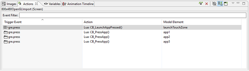
The Actions view provides a display of all of the available actions that are in context for the given selection in the editor.
Actions can be added through the right-click menu in the editor, Add > Action… or in the Actions view directly.
The content of the action list can be sorted by selecting the action table
title. When actions are sorted by their triggering event, the order in which
they appear will also correspond to the order in which they will be evaluated
within the same context. If two actions are bound to a gre.press
event on the same control, for example a Data Change and then a Screen Fade,
then the first action in the list will be executed (Data Change) before the next
action (Screen Fade). The order of these events can be adjusted by
right-clicking the event and selecting or
as required.
The content of the action list is automatically populated based on the Designer model object selected in either the editor or in the Application Model view. The content of the list can be populated in several ways:
- Selection Only
This shows only the actions associated directly with the selected model object.
- Sub Hierarchy
This shows the actions of the selected model object and all of its child model objects.
- Application Hierarchy
This shows all of the actions in the project.
In addition to controlling how the list is populated using the toolbar selections, it is also possible to use the name filter at the top of the list to match against specific event names. This is particularly useful when used in conjunction with the Application Hierarchy to search the entire project for custom events.
The triggering event, action type, and context can all be edited inline in the action table. Each action also has its own set of parameters or configuration options. These values can be changed in the lower display area of the Action view once an action selection is made. When the action types are changed, as many argument values from the original action will be migrated to the new action as long as the argument names and types match.
The Application Model view displays a tree representation of the model objects that make up the Storyboard application.
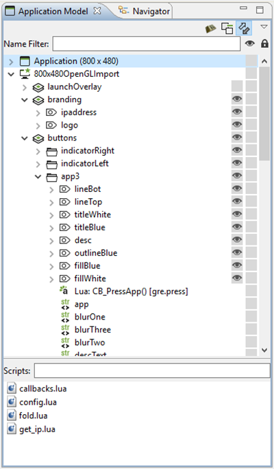
The tree representation aligns with the Storyboard model representation and allows editing operations to be performed on elements that may not be visible within the editor. For each of the application, screen, layer, and control objects the Application Model displays the Actions and Data Variables associated with that model object.
The visibility of the layer instances and controls can be quickly adjusted through the Application Model view by toggling the setting in the visibility column. The changes made here will be immediately reflected in the editor and will also be reflected in the Storyboard Engine runtime file as the initial setting for the layer instance or control.
Since layers are displayed as layer instances, the tree will show layer and control content several times in the tree. If the Link with Editor toolbar option is enabled, when a model object is selected in the Application Model view the editor will automatically scroll to present the appropriate context of their selection. The same behavior can be achieved by double-clicking on a model object if the view's content is not synchronized with the editor.
The Application Model view tree also displays all of the scripts, animations, and unused layers that are currently a part of the application design.
You can copy and paste model elements, such as screens, layers, controls, and actions, from one application to another using this view.
The Animation Timeline view provides an editing environment for creating the animation blocks that are used by the animation action.
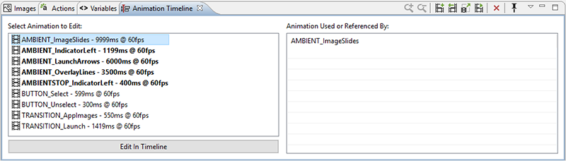
The initial Animation Timeline presentation displays a list of all of the animation blocks defined in the application. Those animations whose names are highlighted in bold represent animations that are currently referenced. The list on the right is updated, based on the selected animation, to show a list of all of the locations in the project where this animation is currently referenced.
Double-click on an animation or select the Edit in Timeline button to change the display mode of the Animation Timeline from a list of all animations to a timeline-based editor focused on the selected animation block. To create a new animation, right-click in the list and select , or select from the toolbar.
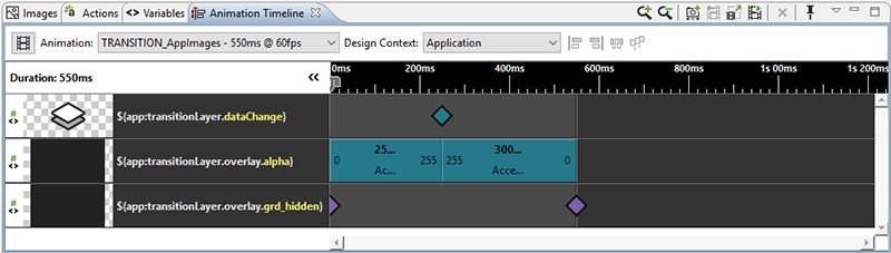
The timeline editing mode displays a list of the variables that are modified during the animation and a timeline view indicating the starting time offset and step duration for a particular animation step relative to all of the other animation steps running in this block.
To see the properties view to modify values, click on an animation step.
Property values can be edited / calculated inline.
To duplicate a step, double-click beside the animation step.
Clicking an animation step displays a pop up window that displays all of its information when the step is too small to do so.
To easily line up the animation steps in the timeline, select multiple animation steps and use the align left, align right, distribute, or pack tools.
Using the 'Design Context' drop-down list, select a context that the animation will use to resolve variables. This context is also used to determine which screen is displayed during an animation preview (see below).
Right-click on an animation group to duplicate its functionality and assign it to another variable.
You can drag and drop the block within the display to adjust the starting offset or lengthen or shorten its duration by resizing the block. The start, end values, and the rate of change can be adjusted inline by double-clicking the values or by right-clicking the block. Animation steps can also be reordered by dragging and dropping them in the list. For animations with many steps, you may want to choose the compressed display option from the menu.
If you want to make a more significant change to the animation step, or to change several values all at once, select a step and click on the 'Change Variable...' button in the properties view and the Animation Step Dialog will open. You will also get this dialog if you right-click and select to add a new variable to animate in this block.
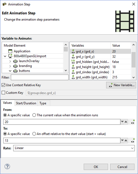
The Animation Step Dialog allows you to select the variable that you want to animate. You can fine tune the characteristics of the animation step including how you want the values to change and when.
There are a number of ways to get started creating animations. You can manually create a new animation from the Animation Timeline View and add the variables to the animation one-by-one, however Storyboard provides a few shortcuts to make this process easier.

To create new animations, Storyboard provides a mechanism that allows you to record a series of changes to your application and have those changes automatically incorporated into a new animation. This capability, Animation Recording, can be accessed from the top menu bar.
The animation recorder tracks all changes that are made to model objects in the application. When the recording is finished it automatically creates new variables for those static values that have changed. It then gathers all of the changed variables and places them into a new animation ready to replay that visual change.
While recording, you have the ability to take snapshots. Snapshots cause subsequent steps created by changes during the recording to be offset by the duration of the previous step. This way, you can create a sequence of consecutive animation steps rather than have them execute simultaneously. The snapshot action is located right next to the recording action, and will only be enabled if you are currently recording.
Note
When using the animation recorder, any structural changes made to the model will be automatically reverted and lost at the end of the recording. The model recording only tracks changes to existing model properties and variables, creating variables automatically for any static elements that change.
This means that, if during the recording any controls, variables, actions, or any other model elements are created, they will not be captured in the recording and they will also not be present in the model when the recording is stopped.

To quickly add new variables to either a new or existing animation, use the Animation Variable command that is available from the editor toolbar or from the right-click menu on many model objects.
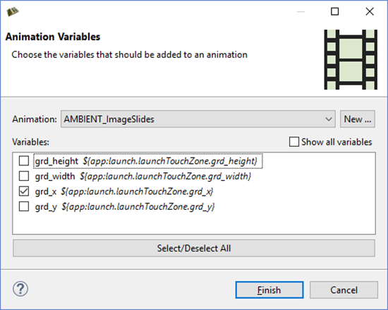
A dialog displays all of the variables that are associated with the current selected object. You can quickly select the variables you are interested in, select the animation that you would like them to be applied to, and immediately start fine-tuning that animation.

Preview the currently selected animation by clicking the animation preview action. An uneditable version of the application is displayed in a dialog and runs the animation. The bottom bar contains actions that control the preview. Play/Pause will stop and restart the animation from the current frame. While the preview is paused, use the Fast Forward/Rewind buttons to move ahead/back one frame at a time. Interact with the progress bar to jump to any frame and click on the Replay button to reset the animation to frame 0 in preparation for another run.
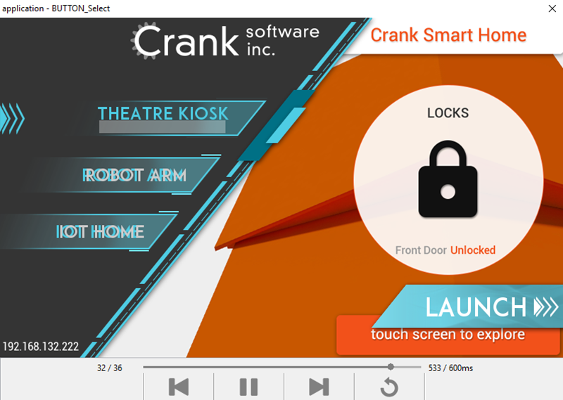
By default, the preview window chooses the screen to display by looking at the animated variables. However, if the user has selected a design context for the animation in the timeline, that context is used to determine the screen to display in the preview.
The Images view provides a thumbnail presentation of the images that are currently included in the application design.
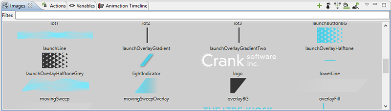
The content for the Images view is automatically pulled from the image file content in the images directory of the Storyboard project. New content imported into this directory, upon a workspace refresh, is automatically shown in the Images view. Supported image file formats include PNG, JPG, GIF and BMP files. In order to import Photoshop PSD file content, the images must be imported using the > > wizard.
You can drag and drop images from the Images view directly into an application design. By default, a new control is created that matches the image's size and the image source is a static value pointing at the drag and dropped image.
Within the Images view it is also possible to quickly switch an image that is used in one context to another using the ... right-click menu. For example, if a number of controls are using an image as a button background and a new image is available to update the look, you can import the new image, select the existing image, and choose Swap Image With... to quickly change all instances within the application to the new look.
All files contained within the images folder are processed as images,
regardless of their file extension. If an unrecognized image file is
encountered, by default it will not be displayed. This behavior can be adjusted
by deselecting Show Only Images in the view's drop-down menu. This
menu also provides the ability to group images by directory which is a
convenient way to classify images that are used in different parts of your user
interface.
As an application evolves, it will often accumulate a number of unreferenced or duplicate resources. The Image view offers a few utilities to help manage these images.
The Resource Clean Up toolbar action prunes and deletes unreferenced images from the application design.
The Consolidate Images toolbar action identifies duplicate images, references all consolidated into a single resource, and removes duplicate images from the workspace.
The Trim Images toolbar action works on selected images to remove all of the extraneous transparency that surrounds non-transparent content. This can significantly impact the rendering performance on systems without hardware graphic rendering capabilities.
The Split Images toolbar action works similarly to the Trim Images option but transforms a single image with significant areas that are completely transparent into multiple images with that transparency trimmed away.
The Layers view provides a thumbnail display of the layers used by the currently selected screen and also displays a thumbnail of all of the other layers that are available for use but are not bound to the selected screen.
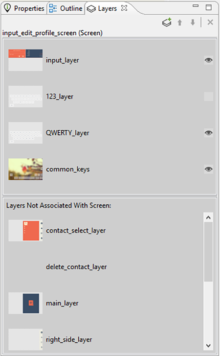
Layers are categorized as either being included on the current screen or not. Layers can be added or removed from the current screen by dragging and dropping them either into or out of the current screen area, or by using the delete key.
Layers are listed according to their front (top) to back (bottom) order z-order presentation. Manipulate the order by dragging and dropping the layers within the view or using the toolbar buttons. In addition, the Layer view provides the ability to change the visibility within the application. If the visibility or z-order are changed, the change is immediately reflected in the editor and will also be reflected in the Storyboard Engine runtime deployment.
Using the toolbar controls in the Layers view it is possible to create new layers and also to open up the Layer editor mode to work with layers independent of the screens with which they are associated.
The Navigator view is a standard filesystem style explorer limited to showing only content available in the Storyboard workspace.
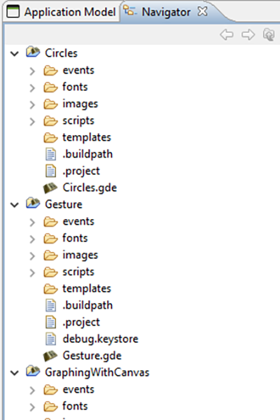
The Navigator view only displays content that has been imported into the workspace and starts with the top level Storyboard Project directories that have been created. Since the workspace allows multiple Storyboard projects to be shown, it is possible to work on multiple projects concurrently all within the same workspace with multiple editors open targeting different Storyboard projects. Content and resources can be copied and pasted among the different editors.
The Navigator view provides a variety of filters to hide/show different file types as well as the ability to group projects together as 'working sets' and then to only display the content from those working sets. For more details on configuring the Navigator and filtering workspace content refer to the Eclipse help > > .
The Outline view provides an overview of the entire editor. The outline content changes to reflect an outline of the editor that currently has focus. Within the Designer environment there are two outlines of interest, the Storyboard editor outline and the Lua editor outline.
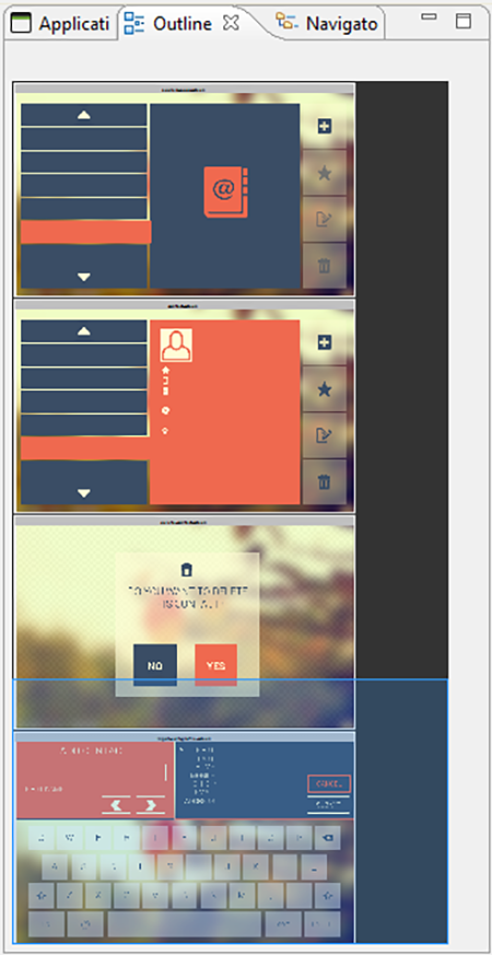
The Storyboard editor outline displays a scaled visual presentation of the entire contents of the editor. If the editor is in Application mode then all of the screens of the application will be shown. If it is in Layer mode then all of the layers will be shown, and similarly for the other editor modes. By moving the highlighted area within the Outline view it is possible to change the viewport of the current editor.
The Lua script editor outline displays a listing of all of the identified functions in the file. Double-clicking the function name provides quick navigation to those functions.
The Problems view shows a list of all problem markers that are created within the workspace. Storyboard provides a project analysis mode that runs in the background to examine Storyboard models and report on design concerns. To enable or disable this analysis mode you can change the Storyboard workspace preference setting in > > > .
When the Storyboard Project Analyzers are enabled, the model will be scanned and analyzed and discovered issues will be reported into the Problems View as the workspace resources change. Issues that are scanned and reported include:
Mismatched image color depths. If a 32bit color image is used with a 16bit color display there is a possibility the image will be distorted on the target.
Fill hides content. If a fill masks on top of other content it can be an ineffective use of processing resources on target devices.
Missing render extension content. For example, a control with an image render extension that is not defined or does not exist. This may cause the embedded target to perform additional computations.
Scaled or rotated static image content. Since static images do not change at runtime, the work required to scale or rotate an image could be replaced by a fixed cost of rotating or scaling the image during the design. This will reduce the amount of processing required at runtime.
The Properties view displays information about the current selection in the editor and also provides the ability to change and adjust the properties of that selection. The Properties view is the primary editing location for fine tuning the visual presentation and adjusting data bindings of the application.
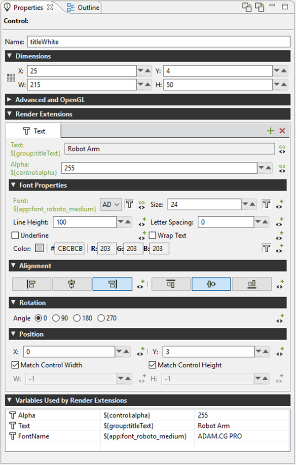
For each model element, application, screen, layer, and control, there is a different property interface that provides access to those items that are most relevant to the selected context. The following is a list of some of the property pages.
- Application
The application properties, active when the editor background is selected, displays the application name, size, and color properties.
- Screen
The screen properties, active when a screen is selected, displays the screen name and indicates if the screen is the start screen for the application.
- Layer
Layers and Layer Instances share a common set of property pages. A Layer Instance is simply a Layer that has been associated with a particular screen. Changes made to a layer's size or its controls will be propagated to all layer instances. Position, opacity, and 3D rotation properties are properties that are not associated with the layer but are associated with a layer instance.
- Group
Group properties contain the name of the group as well as information about the group's origin. In this property panel you will also find the functionality for automatically reconfiguring a group's origin based on it's control content. This is useful when you are taking a group and then converting it for use in a more generic Storyboard Designer template.
- Control
Controls contain the most sophisticated property pages. In addition to the name, size, and position information, the property page also contains the configuration parameters for the render extensions associated with that control. The render extensions are listed in the Z order (front to back) that they will be rendered within the control. This can be adjusted by dragging and dropping the render extensions within the list entry.
- Render Extensions
Render extension property pages show the argument details of the selected render extension. This is the same information as is shown within the Control's property panel, but without all of the additional details associated with the control.
- Actions
The property pages for actions show the parameters that are available for editing and the presentation changes based on action type. The content that is shown here is the same as the information presented in the Action View. In the case where multiple actions are selected, the content can be changed across the entire selection.
When multiple elements are selected, the Properties View attempts to show the most suitable content possible. If all of the selected elements are the same, then the properties view will display the common properties and any changes that are made will apply across all of the selected elements.
In certain cases, such as when multiple controls with different render extensions are selected, it may not be possible to provide a completely synchronized display. In these cases the display will show a common set of properties and hide the properties that are not common among the selected elements.
The Component view provides users with a list of Storyboard Designer components that are
available for use in this project. The list of available components is
generated automatically from the contents of the project's templates directory.
When a component is selected, its description, along with a graphical preview of the component, are shown if available. To create a new model object based on that component, select one of the components in the list and drag and drop it into your application.
Not all components create new Storyboard model objects. Some components simply enhance the functionality of an existing object. In this case, when a model object is selected you can right-click the object and select Component Apply to access a list of available components that can transform the selected object.
For more information about creating components, see the document chapter Chapter 20, Reusable Graphical Components.
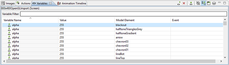
The Variables view is similar to the Actions view in that it displays all of the data variables that are in the context of the current selection.
Once a variable is defined and associated with a particular model object context (application, screen, layer or control) then the variable can be referenced as a parameter for actions and render extensions.
There are two different types of data variables that can be defined. A normal variable contains a name, a type (i.e. number, string), and the value matching the type that should be used when the variable is referenced. To facilitate working with repetitive data within a table control, a special type of variable called a table cell variable can be created. This variable contains all of the same properties as a normal variable, but is extended to contain additional row and column information that can be used to specialize a particular value at a given table row and column.
The content of the variable list can be sorted by selecting the appropriate variable table title and the variable values can be edited inline in the variable list by double-clicking on the appropriate field that you wish to change.
Similar to the Actions view, the variables that are shown in the Variables view are automatically populated based on the Designer model object selected in either the editor or in the Application Model view. The content of the list can be populated in several ways:
- Selection Only
This shows only the variables associated directly with the selected model object.
- Sub Hierarchy
This shows the variables of the selected model object and all of its child model objects.
- Application Hierarchy
This shows all of the variables in the application, regardless of what the current selection may be.
In addition to controlling how the list is populated using the toolbar selections, it is also possible to use the name filter at the top of the list to match against specific variable names. This is particularly useful when used in conjunction with the Application Hierarchy to search the entire project for a variable.
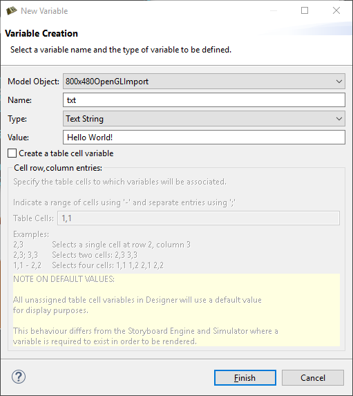
New variables are frequently created at the point where they are required, for example, within the property display for a render extension or the properties for an action argument. When variables are created in this context, then their types will automatically be determined from the context of use. However, variables can also be created directly from within the Variables view, in which case the user can select the type of the variable. It's important to match the type of the variable to its intended use. For example, text variables can't be used as adjustments for numeric values and vice versa.
The variable creation opens the New Variable wizard. From within this dialog you can select the name of the variable, its data type, and the value to associate with the variable. From this dialog you can also create table cell variables that span a particular row/column range
By default, the variable will be created and associated with the current application, screen, layer, or control that was selected when the New Variable wizard is launched. However this association can be changed on the second (optional) page of the New Variable wizard where the variable can be explicitly assigned to a different model object.
Note
The type of a variable is important for the Actions or Render Extensions that may use them. If a variable is mistyped, such as a string variable that is created but referenced in a location expecting an RGB color value, then the results are undefined. In general, you should create variables from the Actions or Render Extensions that will be using them to ensure the proper typing occurs.
It is possible to associate a user-defined event to be generated when a variable's value is changed. These events are designed to facilitate the synchronization of user interface elements that may not be directly associated with the variables whose data is changing. A typical scenario would be to monitor the position or location of a control and send a notification when it changes in order to maintain a corresponding relationship in another control.
In order to specify the event to be generated, simply enter the event name into the Event column of the desired variable or select the variable from the list and right-click and select which will open the event definition list allowing you to pick from existing events or create a new one.
The variable change events are designed to be used to synchronize the user interface display with an updated variable value and are not meant to be used as counters for each changed value of a variable. For each variable change an event is added to the event queue only if there is not already an event with the same name in the queue waiting to be processed. Until that event is serviced, no additional events will be queued for that variable, or any variable generating the same event name.
The Notes view displays notes attached to model objects within the current project.
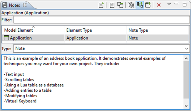
Notes contain text to help organize a project or keep track of useful information specific to a particular model object. Notes also have a type associated with them which can be selected using the combo box in the editing area. To create a custom type, simply type in the combo box instead of using the drop down. When a note with a custom type is added, that type will be added to the combo box so that it can be quickly selected from the drop down when making other notes.
Notes attached to the current project are displayed in the table. It can display in three modes:
In context - only displays the note associated with the select model object.
Sub hierarchy - displays the note associated with the selected model object and any notes associated with model objects with are children on the selected object.
Full application - displays all the notes in the application.

You can search for notes by typing in the filter text box. Sort the contents of the table by clicking on the header of one of the columns (e.g., clicking Model Element will sort the notes alphabetically by the name of the model object the note is attached to).
Add notes to any model object through the right-click menu by selecting > , or by selecting the model object and clicking either the New… icon in the Notes view or by clicking in the text box where it indicates Click to add a new note…. To delete a note, select it in the table and then click the red X, or right-click it in the table and select delete.
To display the model object that a note is associated with, right-click a note in the table and select > .
All the notes in the current project can be quickly summarized in a list by clicking Toggle Full View (the yellow page icon).
